Andy Warhol or The horrific beauty of ‘Death & Disaster’
1928-1961
In 1928, Andrew Warhola is born by Jukie and Andrej Warhola in Pittsburgh, Pennsylvania. Andrew Warhola, son of Slovakian immigrants would later be known as Andy Warhol, the renowned artist. Being a sicking boy, he once had to spend two months in bed, during which, he became obsessed with Shirley Temple. He started studying drawing at the Carnegie Institute and soon after his enrollment, he was hired to paint the shopping windows of the ‘Joseph Horne’s’ department stores. It was with this money that he made his first trip to New York. 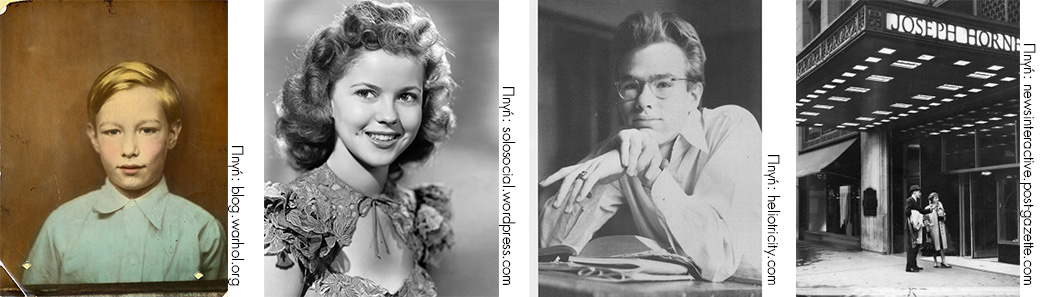
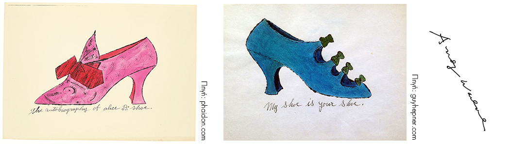
In 1940, he designs shoes for ‘Glamour’ magazine, while working as a shop decorator and book illustrator. During this period, he changes his name into Andy Warhol.
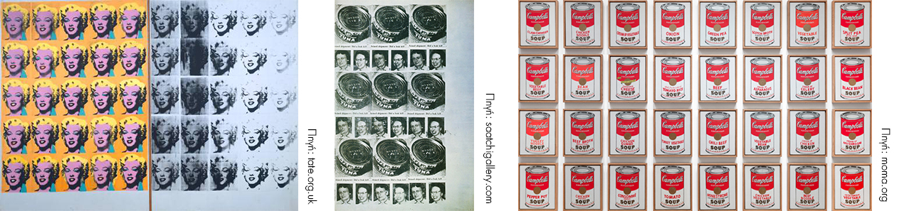
In 1950-1960, he organizes a campaign against drugs for the New York Times, while creating his first pop-art paintings, depicting Coca-Cola bottles, dollar bills and Campbell cans. We will be focusing in Warhol’s third creative decade, a period marked by the ‘Death & Disaster’ series, which is known for its intense, social connotations – to say the least.
1962-1967
Between August of 1962 and the end of that same year, Andy Warhol produced 2.000 images. One of his quotes could serve as the perfect introduction to our exploration of his ‘Death & Disaster’ series:
“Some people, even intelligent people, say that violence can be beautiful.
I can’t understand that, because beautiful is some moments,
and for me those moments are never violent.“
In 1962, he presents the ‘Death & Disaster’ series, along with the Marilyn Monroe portraits. This particular series went through a lot of processing, in order to utter – or not, since we do not know whether Warhol had any such intent – its particular message. Warhol would always remain loyal to a certain creative distance through the use of many of his characteristic techniques. Still, some of those images bare a certain emotional power due to their colors and repetitive patterns – even their ‘mistakes’, which were the result of his technological mediums. It is only logical that this series, along with his images of daily commodities, would be seen as a comment on the violation of the trust the American people has placed in the products of the Industrial Revolution, denouncing them as causes of death in his ‘Tuna Fish Disaster’ work, which exposes the dark side of the Campbell Soup cans. And, who knows? Maybe, at a deeper level, these paintings could also relate a story or two.
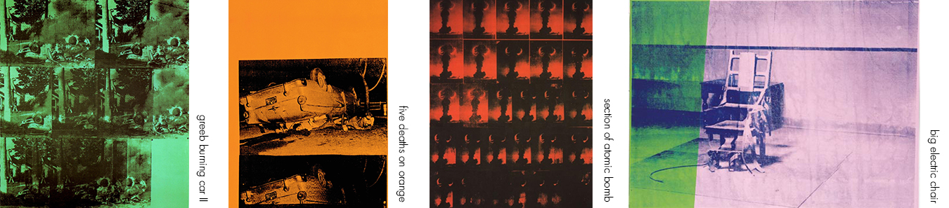
The pictures he chose, followed the rules of photojournalism. Images of suicides, car crashes, race riots, the rescue of a fire victim, or an atomic bomb explosion… They all capture a particular incident in the non-romantic context of real life. On the other hand, the use of different colors creates a variety of feelings. The pastel shades he uses in works like ‘Green Burning Car II’, or ‘Five Deaths on Orange’, seem to be focusing on the simple visual pleasures of spontaneous painting, infusing into the work a kind of disturbing irony in juxtaposition with the cruelty of the scenes themselves. On the contrary, the red color he uses in one of his ‘Section of Atomic Bomb’ versions, intensifies the context in the most dramatic way, red being the color of blood and danger alerts. Likewise, the blue color of his ‘Death Row’ denotes the deadly silence following the activation of the electric chair.
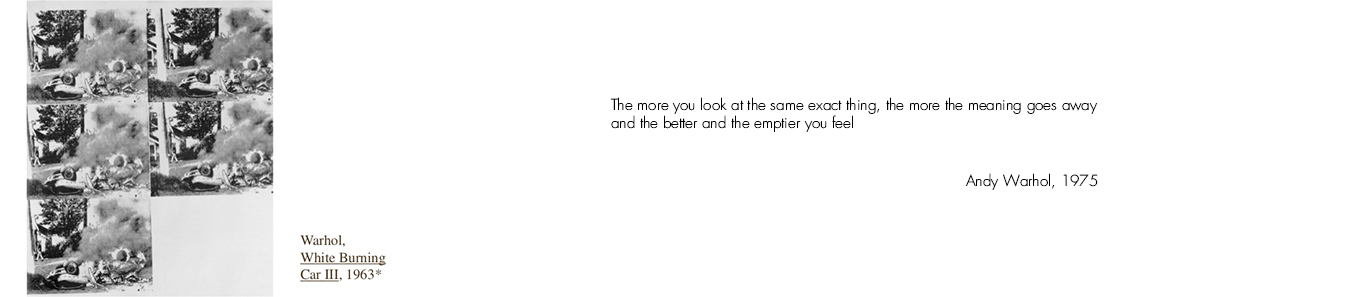
His repetitive images on the canvas convey the theme’s crucial character, achieving a sense of inner distancing without resorting to over-dramatizations or open condemnations. As Warhol, himself, once put it: “When you see a gruesome picture over and over again, it doesn’t really have any effect.” Here is an example: in ‘White Burning Car II’ (1963), repetition directs the viewer’s attention to the details – the bystanders and the surroundings. It is a sort of sarcasm, adding a kind of ignorance to the scene’s horror, recurring again and again. This leads us to the conclusion that the ‘Death & Disaster’ series is a comment on our extreme familiarization with violence, which after a certain point makes us indifferent towards it.
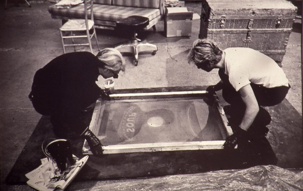
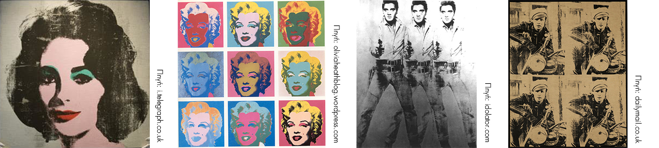
In 1963, Gerard Malanga becomes Andy Warhol’s assistant, just when he starts working on his ‘Electric Chair’ and ‘Race Riot’. This is how Malanga describes the beginning of his new carrier: “…we began with a silkscreen of Elizabeth Taylor’s portrait on a silver spray background…” The portraits of Monroe, Taylor, Presley and Brando represented the ideal of beauty, success and sex appeal, as promoted in the Hollywood films of the ‘30s and the ‘40s. Those works were a blow to the groin of the American high society. The fact that an artist would chose Marilyn’s picture as his theme, only days after she had overdosed on sleeping pills, while desperately calling for help… Warhol created an immortal memory. He included his numerous portraits of Marilyn – showing the picture of a young actress – in his death series, along with images of accidents and various disasters. It is a series which contradicts the ‘American way of life’, exposing its inner relations to death. We must always keep in mind that Warhol himself was fully aware of the fact that everything he did was revolving around death.
In the same year, Andy began working on Jackie Kennedy’s portrait. John Fitzgerald Kennedy was the second-born child of the Kennedy family and was the 35 th President of the United States, until the 22th of November, when he was assassinated. Jackie Kennedy’s picture, showing her crying behind her husband’s coffin, shocked the media even more than the actual assassination. Andy used it in different versions, choosing five different pictures as his theme. Jackie, this young, rich girl of French descent, represented the nation’s hope for a union of politics with culture. The sense of freedom and progress which had swept the country off its feet during the Kennedy Presidency was shredded to pieces by his widow’s image. It became a symbol which altered our idea of our past in the most tragic way. Warhol uses Jackie’s images in ways which surpass any common approaches, narrating the tragic tale of a happy and smiling young woman who suddenly turns into a mourning widow. Time seems to be flying over this image – a technique he has never used before. Warhol applied different photographic shots on the same canvas, systematically undoing the picture itself, or changing it with the use of extensive, monochromatic shadings.
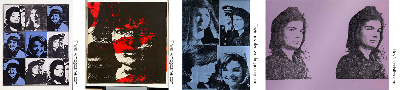
Jackie Kennedy’s four-framed portrait, showing her smiling and mourning images side by side, symbolizes the ephemeral nature of happiness itself. Using the natural power of authenticity, the object fades in its blurring outlines and as it fades, it powerfully unveils a world of mourning, hidden behind the mass media’s cover up. Like an expensive car, symbolizing wealth and happiness, which could easily be diminished into nothing more than worthless pieces of metal. Warhol once said that the death series was divided in two parts. The first part was centered on famous deaths and the second on people nobody ever heard of. He felt that someone ought to think about them from time to time – the girl who jumped off the Empire State Building, the ladies who ate the poisoned tuna fish, the people who were killed in car crashes. He didn’t choose them because he felt sorry for them. But he wondered over the fact that people go by, on their way to work, without caring if someone completely unknown has been killed. So he thought it would be nice for those unknown people to be remembered by those who, ordinarily, wouldn’t think of them.
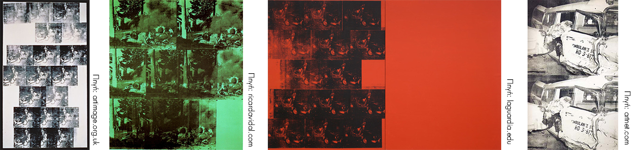
Just before he died, Andy Warhol started painting cars, connecting them with violence, indifference and the horror of death in the middle of the street. A white car (accident, 19 times), a green car (burned down), an orange car (accident, 10 times), the destruction of an ambulance – only to mention of few of Andy Warhol’s last creations. His images, which he found in various newspapers, made the viewers experience something of the incident’s atrocity. An artist who doesn’t address such issues could never be seen as cynical. Paintings like ‘Death & Disaster’, ‘Red Car Crash’, ‘Purple Jumping Man’ and ‘Orange Disaster’ turn personal tragedies into public spectacles, pointing at the exploitation of such images by the Mass Media. In ‘Green Car Crash’, for example, the scene Warhol uses for his painting is that of a blurry, suburban road which turns into a surrealistic nightmare. Violence appears raw, and yet covered behind a supernatural veil which brings the viewer in a state of horrified awe, whereas the clarity of the original picture itself doesn’t stir any feelings, anymore.
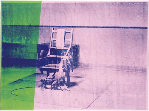
In January, 1964, Andy Warhol holds his first personal exhibition at the Ileana Sonnabend Gallery, in Paris, making a significant impact on European artistic circles. As he stated in his first extended interview: “My show in Paris will be called ‘Death in America’.” According to Warhol’s philosophy, a wanted criminal whose photo is seen in public spaces, is a star of some sort. People have tried to tie a social message on works like ‘Electric Chair’, or ‘Race Riot’. One of the last works in ‘Death & Disaster’ is a big silkscreen of the ‘Electric Chair’.
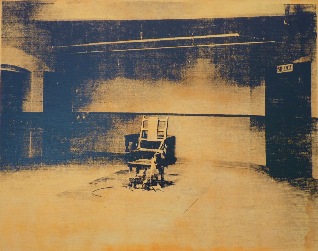
This work concludes the ‘American Death’ series. Even though Warhol himself has denied it, it reveals some the things we tend to forget in our complacency. Repetition diminishes the theme’s hidden accusations, affirming its creator’s impassive involvement. ‘Electric Chair’ represents America, as clearly as the Statue of Liberty. What better way to close the ‘Death in America’ series? The bottom line is that Andy loved America for its flaws and extreme contradictions.
Unlike the other versions of 1967, the Big Electric Chair zooms in closely on this deadly machine. Much to our surprise, this reduces (rather than increasing) the image’s dramatic power, concealing the surrounding emptiness along with the sign ‘SILENCE’, which denotes a crowd watching the execution. Color serves the same purpose. Contrary to other versions, this time Warhol chooses more neutral shades of pink and greenish-blue. His comment on a society which has turned death into a spectacle incapable of stirring any emotions, couldn’t be more eloquent.
February 22, 1987
This is the tragic day of Andy Warhol’s death. The artist’s idea of this day was a bronze coffin with a white coating and a few friends to bid him farewell. The ultimate illustrator of his era concluded his study on death, wearing a black, Kashmir suit, black glasses, a floral tie and his beloved, blond wig. Whether his point of view is clear or confusing, he was one of the few artists who succeeded – by mere color and theme – in revealing the inner depths of an accident or a suicide. It is now generally accepted that he was among those who brought violence to the forefront, only to indicate the observer’s emotional numbness, as he stands there watching, incapable of any feeling whatsoever. The very simplicity of his themes makes us face our common fears and addictions in a most unique way. And even though Andy himself denies it, he keeps commenting on our indifference in the face of daily violence. A repetitive indifference which never fails to demonstrate itself again and
again.
Maria Myl
Graphic Designer
Βιβλιογραφία
Alexander P. “Death and Disaster: The rise of the Warhol Empire and Race for Andy’s Millions”, Villard: 1994
Daquino J.E. “Nihilism Never Looked So Good: A Meditation on Violence, Death and Catastrophe in the Art of Andy Warhol”, 2007
Golec J.M. “Media Aesthetics, Sense Perception and Andy Warhol’s Blue Electric Chair” in Series & Society, Vol. 4, Issue 1, pp 23-46, March 2009: Berg Publishers
Siebers, Tobin: “The Return to Ritual: Violence and Art in the Media Age.” Journal for Culture and Religious Theory vol. 5 no. 1 (December 2003): pp 9-33
Qaranta, D. Warhol Η Καθημερινή: Αθήνα, 2006
Patterson, J. “The “Plebian” Catastrophes”, in www.hatii.arts.gla.ac.uk, 1997
Sfafe, L. “Andy Warhol (1928-87) A Lavender Disaster. 1964 Screeprint” in www.sfafe.co.uk, 2009
Imran, O. “Andy Warhol-Stars, Deaths, and Disasters” in www.imranomerart.com
Φωτογραφία Εξωφύλλου: De Menil Collection, 1989. Softcover coffee-table book.
- SHARE